Friday, December 10, 2021

Design Classics

David J Howe takes a look at a classic design of book covers from one UK publisher in the 1970s.

They say that you should never judge a book by its cover ... and yet we do it all the time. Nevermoreso than when looking at covers which enchanted and moved us back when we were children ourselves. Everyone has their favourites, whether it is the Pan Books of Horror edited by Herbert van Thal, or the Narnia books from C S Lewis, or Susan Cooper’s magnificent The Dark is Rising sequence … but standing head and shoulders above them in my opinion are some series of paperback titles published by the Universal-Tandem Publishing Company in the seventies.

Universal-Tandem was not large, and was run by an entrepreneur by the name of Ralph Stokes who employed approximately nine staff to handle everything, including Sales Manager Brian Miles. The company specialised in publishing mass market paperback fiction and non-fiction. Universal-Tandem’s book covers were almost exclusively handled by a freelance designer, Brian Boyle, who had a knack of creating an eyecatching cover. 

In 1968, Tandem had published three novels which tied into the Sergio Leone Dollars Trilogy of films: novelisations of For a Few Dollars More and The Good The Bad The Ugly were published, along with an original novel, A Dollar to Die For, and each featured photographically based covers. The rights to the original film – A Fistful of Dollars – were not available due to a legal wrangle with Akira Kurosawa over similarities to his film Yojimbo.

Miles recalled that once the legal issues were ironed out, then they were free to get the novelisation sorted. ‘Tandem had already established the first Dollar books from the American editions but there had not been a book for the first film. So I was very friendly at the time with Terry Harknett who wrote for one of the Trade journals, and I arranged a showing of the film in one of the private cinemas in Wardour Street and obtained the script and he wrote the book. The book was just as successful as any of the American editions!’ Harknett published the book under the name Frank Chandler, and went on to have a successful career as a Western novelist writing as George G Gilman with his series of Edge books from New English Library.

In 1972, the novelisation of A Fistful of Dollars was released, together with reissues of the earlier titles, all with new matching covers featuring a simple title with colour illustration and a white backbround and a dollar bill at the top which incorporated each author’s name. A young artist called Christos Achilleos was commissioned to create these 1972-onwards covers, and he continued to complete eight titles in the series.

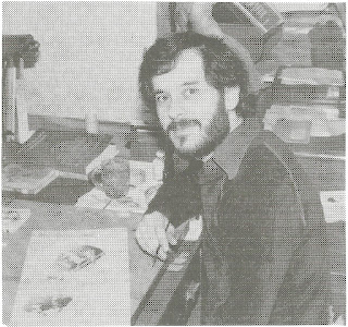
‘I came straight out of art school in 1970 and went into a job doing maps and illustrations based on my degree exhibition,’ explained Achilleos. ‘I spent six months doing that, and was then made redundant! So I headed into Foyles, the big bookshop, and looked at the book covers and started to ring around the publishers. One of the people I contacted was Brian Boyle. He was mainly a photographer, but worked as a freelance designer, and he gave me a couple of jobs: I remember the first was three covers for a fantasy series about Brak the Barbarian for Tandem. He then asked me to come and work in the studio with him at Great Portland Street, so I did, and I was doing art and book paste up and layout as well as painting covers. He quickly gave me a pay rise and wanted me to stay, and when the “Dollars” commissions came in I grabbed them.’

Achilleos decided to use a specific method for creating the covers for the Dollar Westerns. ‘The image was intended to be printed in three colours, so I first sketched out the element that I wanted in black using an art pen. Then I overlaid a sheet of tracing-paper-like material and created on top – again in black – the areas I wanted to be in brown or sepia. Finally I created another layer with the red sun background on. All these layers then went to the publishers with the instructions as to which colour each layer should be. It was a good way of creating the images! I also painted and designed the dollar bill for those covers.’

There was one exception to this approach, and this was 1974’s first edition of The Million Dollar Bloodhunt which used artwork with a colour background from the outset. Reprints of the books from 1974 retained the dollar bill at the top, but most now included a full colour background to the art. ‘Later on,’ explained Achilleos, ‘when they wanted to reprint the books, I took my original layers, and overlaid a sheet of white paper, carefully cut out to reveal the original black and white image, and then painted the colour element on that. The completed image was then stuck down on art board to create the finished art.’ 

From 1977, further reprints dropped the dollar bill design from the front cover and again mostly included Achilleos’ amended art (Blood for a Dirty Dollar however reused the original cover art rather than using the ‘colour background’ art). These reprints started as Tandem paperbacks but transitioned to Star (as Universal-Tandem had been bought by Howard and Wyndham in 1975 and they were rationalising the imprints). It’s interesting too that the title for the novelisation of the film The Good, The Bad and The Ugly, which had originally been published as The Good The Bad The Ugly, had the missing ‘and’ added to the book title for the 1977 reprint.

By 1972, Universal-Tandem was doing so well that Stokes and Miles, wanted to expand further and to set up a childrens’ imprint, which they called Target. They engaged an editor called Richard Henwood, and Henwood set about finding titles for the new imprint.

‘Undoubtedly,’ said Miles, ‘what guaranteed the success of Target was the Doctor Who acquisition right at its heart. Definitely a publishing scoop of the first order that, retrospectively, I feel very lucky and privileged to have had come my way.’

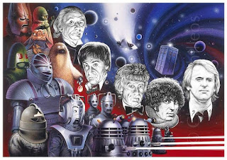
Henwood picked up paperback rights for three Doctor Who novelisations (Doctor Who andthe Daleks, the Crusaders and the Zarbi) which had been written and first published in hardback (and the first two in paperback) in the sixties, and to provide the covers for the new Target paperbacks, they again contacted Christos Achilleos 

‘One day I got this call from Brian Boyle,’ Achilleos recalled. ‘He said that Universal-Tandem were doing three Doctor Who books, and would I like to do the covers? They wanted to have something like the ones that Frank Bellamy had done for the Radio Times; so they asked if I would do them in that style.’

Achilleos was provided with photographs, and created his covers using a style reminiscent of that of Bellamy, of who Achilleos was a big fan. ‘Generally when you illustrate a book,’ he recalled, ‘you get a copy of it and either it’s a reprint, in which case you can have a look at what the other fellow’s done, or if it’s new, you just read through a manuscript quickly looking for something visually exciting, maybe an actual scene in the book. But the cover is more than just an illustration of a particular bit in the book, it has to be a graphic interpretation of it. The cover of a book is what sells it.

‘As far as designing the Doctor Who covers was concerned, it was left entirely up to me. The art director would tell me which one was next, and I just gave him the finished product, which was how I got away with so much. I used a technique I’d learned at college for scientific illustration called pointillism for those covers, with a rapidograph pen which had just been released. The cover design and style was similar to that I’d used for the Dollar Westerns and other works.’

The Target imprint launched in May 1973, and the first 12 titles in the Doctor Who range represent a clear iconography and style (as well as the first three, these were: Doctor Who andthe Auton Invasion, the Cave Monsters, the Day of the Daleks, the Doomsday Weapon, the Sea-Devils, the Daemons, the Abominable Snowmen, the Curse of Peladon and the Cybermen). They are clean covers with colourful images against a white background, and with a simple block logo for the Doctor Who title. Of particular note is the fact that the lead character – in this case the Doctor – is rendered in black and white – the same approach as on the Dollar Western covers – which gave a neat focal point to the art. There is a magnificent consistency and excitement about the covers and their design, and this conformity was key to their success in crowded bookshops. Kids buying them were drawn to the imagery of monsters and adventure, and the simple design made them stand out on bookshop shelves. 

Also during 1973, as part of the initial ‘buying spree’ of books for the Target imprint, Henwood obtained the paperback rights to another series of novels, this time by a Swedish author called Nils-Olof Franzén. The Agaton Sax novels were an ironic pastiche on detective fiction and featured a titular detective who smoked meerschaum pipes (one for each day of the week) and a hapless Inspector Lispington of Scotland Yard (who seemed modelled after Lestrade from the Sherlock Holmes stories). They were first published in Sweden from 1955 onwards with covers and illustrations by Åke Lewerth, with André Deutsch in the UK publishing hardback editions from 1965 with covers and illustrations by Quentin Blake, a popular cartoonist and illustrator known for his collaboration with writers such as Russell Hoban, Joan Aiken, Michael Rosen, John Yeoman and, most famously, Roald Dahl. 

Researcher Charlotte Berry discussed the decision to use Blake for the UK hardback books in her 2016 essay ‘Keeping the Spirit of the Text’: ‘British children’s editors gave careful consideration to illustrations in their translated Nordic titles. Following the precedent set elsewhere in commissioning new British illustrations for translated children’s fiction in order to create a strong in-house style, Quentin Blake was selected as the new illustrator of the series as early as May 1964 as Pearce [Philippa Pearce, first Children’s Editor at André Deutsch] felt “his sense of humour exactly matched the humour in the stories”. As Royds [Pamela Royds, second Childrens’ Editor at André Deutsch] comments, “Agaton Sax [did not] establish his reputation in children’s literature but [...] built on it”.’

The covers for the new Target paperback editions were also by Blake, and he was most likely chosen for the covers precisely because of this intimate relationship forged with the subject matter, something that Achilleos had also achieved with the Doctor Who titles.


Berry notes in her essay:  ‘Blake also became involved in the publicity for Agaton Sax and the League of Silent Exploders (1974), attending the Deutsch stand and doing drawings on the spot at Heffers’ Bookshop in Cambridge in autumn 1973 where the paperback Target editions “sold like hot cakes” according to Royds.’

The first four Target paperback Agaton Sax titles (Agaton Sax andthe Diamond Thieves, the Scotland Yard Mystery, the Bank Robbers (renamed from Agaton Sax and the Max Brothers) and the Criminal Doubles) went on sale in November 1973, and, it seems, were instantly as popular as the Doctor Who titles. These were followed up in May 1975 with the London Computer Plot and the Colossus of Rhodes, with a final title, Agaton Sax and the League of Silent Exploders following in August 1976. 

‘The Agaton Sax books were not a great success,’ said Miles, ‘but the curtailment of further publication of that series may have had something to do with the destruction of Universal-Tandem by the takeover by Howard and Wyndham.’ Indeed there were three Agaton Sax titles which never received a Target paperback edition.

A further range of novels, again with the covers and logo painted and designed by Achilleos, was the K’Ing Kung-Fu series by the pseudonymous Marshall Macao. Published by Universal-Tandem from 1974 onwards, the books featured a series logo, with the book title and colour artwork presented against a white background. As Achilleos said, ‘It was a design structure that I was pleased with, and so I used it a lot on several different titles and ranges of books.’ The K’Ing Kung-Fu range ran to four titles in the UK, and Achilleos used a similar cover design on another title from Tandem: Kung Fu Master Richard Dragon: Dragon’s Fists by ‘Jim Dennis’ (Dennis O’Neil and Jim Berry), later to be developed by O’Neil into a comic book series for DC Comics.

What is distinctive about all these diverse ranges of books is the way that the covers are simple and uncluttered, and yet each has a precise series feel to them and draw you in: you want to collect all the books in the range, and the covers all sell the respective series magnificently. Even those initial Dollar Western covers, with the dollar design at the top, have a simplicity which just feels right. 

In many ways these covers from Universal-Tandem, combined with the art and design from Christos Achilleos and Quentin Blake, form perfect paperback covers: memorable, effective and collectable. And all are true design classics.

With thanks to Brian Miles, Christos Achilleos, Russell Cook, Gary Russell, Matt Evenden, Mark Wayne Barrett, Peter Mark May, Stephen Laws, Fritz Maitland, Tim Keable.

References:

Howe, D. (2009) The Target Book (Telos Publishing, England)

Berry, C. (2016). Keeping ‘the Spirit of the Text’: A Publishing and Translation History Case Study of Nils-Olof Franzén’s Detective Series Agaton Sax. Barnboken – Journal of Children’s Literature Research, 39. https://doi.org/10.14811/clr.v39i0.258

Holland, S. https://bearalley.blogspot.com/2010/09/few-dollars-more.html

Achilleos, C. http://chrisachilleos.co.uk/

Written in May 2020.

Remembering Christos Achilleos


David J Howe with Chris Achilleos and Peter Capaldi at the Cartoon Museum in London, 2016

I grew up with Chris Achilleos! One of the earliest items of Doctor Who merchandise that I bought with my own money was a copy of the Target novelisation of The Curse of Peladon. It was also the first Target book that I owned ... and that cover!  From the elegant black block logo, to the painting of the Doctor, an Ice Warrior, Alpha Centauri and Aggedor, it drew me and entranced me.

I found other books with art by the same guy ... all of them perfect recreations of those television adventures. And closer inspection gave the artist a name. Chris Achilleos.

The Curse of Peladon cover art
As time passed – I bought The Curse of Peladon in 1974 – I got more of those iconic Target books. And in 1977 I started my own fanzine – initially called The Surbiton Doctor Who Appreciation Society Magazine but which morphed quickly in to the much easier to digest Oracle – and printed Target news therein, gleaned from catalogues and press releases and, of course, the Target Book Club (Sandy Lessiter – whatever happened to him/her?).

When time came for the final edition of Oracle, published at the end of 1981, I wanted to fill it with special things ... and none more special than an interview with the legendary Chris Achilleos. But how to find him?

It was in the London telephone book of all places (the same way I found the phone number for Terrance Dicks!). Luckily there weren’t many Achilleoses in the phone book – in fact I think there was only one – and I found myself speaking to Chris.

We arranged to meet, and I spent a happy afternoon (2 May 1981 in fact) at his house in North London, looking at artwork originals and having my mind blown at the size, the colours, the detail – much of which was lost in the translation to a small paperback reproduction.

Chris in his studio, 1981
We talked and the resultant interview went into that final edition of Oracle along with the photographs I took of some of his amazing originals. There was no digital scanning here ... it was all old-school!

I stayed in contact with Chris, and, as he was willing to part with them, managed to buy some of the Doctor Who original artworks, some of which I still have to this day.

By 1983 I was running the Doctor Who Appreciation Society’s Reference Department, and had the idea to do a special ‘Making of’ magazine about the show’s 20th Anniversary story, ‘The Five Doctors’. And who did I want to do the cover. Yes, of course it was Chris.

So we met and discussed and planned. I sorted out photographs, and art edited the cover (I wanted to do it as a poster as well as using it on the magazine, and so needed to foil stamp the title on the cover (so it wasn’t on the poster)) ... things like that were tricky and fiddly back then!

The Making of The Five Doctors artwork
Chris duly delivered the art and it was massive! Easily three times bigger than any of his other Doctor Who paintings, but we managed to get it photographed to provide the transparency for the printers to create the printing plates from.

Time went on, and Chris released books of his magnificent art ... Amazons and fantasy and Doctor Who and Star Trek and everything in between ... he was so prolific!

We talked about the business, the industry, artwork and ideas ... He would often call me for advice on various elements, or for help with reference materials – Chris was not native of the UK, and as he readily admitted, was not good with certain aspects of the business, and so I helped as and where I could.

King Kung Fu cover
I recently penned an article about some of his non-Doctor Who cover work, extolling the genius of his layout and design training and skills, which he applied to Kung Fu and Fistful of Dollars book ranges, as well as the Doctor Who titles ... and he was gracious enough to add in background details and to explain finer points where I had gone astray. You can read it here: Design Classics

The last time we spoke, he called to ask my advice on a new Doctor Who Calendar he wanted to do: what should he call it? Ideas for how to present it ... Of course we had a natter and a laugh as always ... 

And now he is no longer with us. 

His art and genius will live on in those covers, ideas and concepts. His work has always been the benchmark for excellence and imagination, and in the eyes of his fans, he was unmatched.

I truly hope that his more recent forays into the world of conventions: meeting the fans, setting up and selling prints and posters and books; all helped him to see how loved he was, and how influential his art was, not just to those who bought the books as a result of seeing it gracing the cover, but to artists who followed in his wake: inspired to try and create work which would move people, which would sum up a story or a concept, and which would push at the boundaries of what commercial art and illustration was capable of.

I’m going to miss Chris. I can still hear his distinctively accented voice telling me about how he created his covers ...

RIP Christos Achilleos. 26 September 1947 – 6 December 2001.


Sunday, November 21, 2021

Review: Phantom of the Mall: Eric's Revenge (1989)

What is immediately unusual about this 1989 horror flick is that it plays as though it is a sequel to another film - perhaps called Phantom of the Mall? - but it isn't. This is a standalone film which riffs on The Phantom of the Opera, transplanting the action to an LA Mall, with the Phantom being Eric (Derek Rydall), a young chap disfigured in a house fire a year before, who is now stalking his girlfriend Melody (Playboy centrefold in February 1988, Kari Whitman) (who survived the fire) and her friends as they visit and work in the Mall, which has been built on the site of his old home.

It's a predictable setup, with one of the Mall guards (Gregory Scott Cummins) being the person responsible for the original fire ... and everyone who meets or tries to date or interfere with the girls gets killed by the Phantom ... Another security guard (Terrence Evans) who spies on the girls in the dressing rooms is electrocuted; the pianist (Dante D'Andre) turns out to be another stalker who tries to molest the girls in the carpark - he is shot with a crossbow and then bitten by a cobra introduced into the toilet system - and the Mall owner's son (Tom Fridley) tries to molest Melody only to have his head crushed in a trash compactor!

It's enjoyable hokum as the bodycount rises and Eric plants a bomb in the basement, intending to kill everyone, including the Mall owner (Jonathan Goldsmith) and the Mayor (Morgan Fairchild), both of whom were complicit in the fire.

There are some daft elements along the way, and the film seems to have half an eye on the humour of this sort of film ... an eyeball popped from a head ends up unseen in a tub of icecream! And there's a lot of chasing up and down Mall escalators and passageways!

If you're a fan of eighties horror hocum then this is for you. It's well made and nicely put together, the acting is OK, and there's even some boobies on show ... all in all a typical teens in peril horror film!


As always, the Arrow package is superb, with two disks of entertainment!


  • Three versions of the feature: Original Theatrical Cut, TV Cut and bonus composite “Phan Cut”! 
  • High Definition Blu-ray (1080p) presentation
  • Original uncompressed mono audio on all cuts
  • Optional English subtitles for the deaf and hard of hearing on all cuts
  • 60-page fully-illustrated perfect-bound book featuring new writing on the film by Brad Henderson and original press kit extracts 
  • Large fold-out double-sided poster featuring original and newly commissioned artwork by Justin Osbourn
  • Six postcard-sized lobby card reproductions
  • Limited edition packaging with reversible sleeve featuring original and newly commissioned artwork by Justin Osbourn

Disc One – The Theatrical Cut (Blu-ray)

  • Brand new 2K restoration of the Original Theatrical Cut from original film elements (90 mins)
  • Brand new audio commentary with director Richard Friedman, moderated by filmmaker Michael Felsher 
  • Brand new audio commentary with disc producer Ewan Cant and film historian/author Amanda Reyes 
  • Shop Til’ You Drop!: The Making of Phantom of the Mall – brand new making-of documentary featuring interviews with director Richard Friedman, screenwriters Scott Schneid and Tony Michelman, actors Derek Rydall and Gregory Scott Cummins, filmmaker Tony Kayden and special make-up effects creator Matthew Mungle
  • Alternate and Deleted Scenes from the TV Cut 
  • Domestic and International Trailers
  • Image Gallery 

Disc Two – The Tv & Phan Cuts (Blu-ray)

  • Brand new 2K restoration of the TV Cut with Standard Definition inserts for the footage unique to this version (89 mins)
  • Composite “Phan Cut” combining footage from both the Original Theatrical and TV Cuts for the ultimate Phantom of the Mall experience! (96 mins)


Review: Mill of The Stone Women (1960)


I'd never heard of this early 1960 Italian horror film, so thanks to Arrow for digging it out from whatever vaults it had been languishing in!  It's actually a pretty decent film overall, nicely shot and with some good performances and intrigue to get you wondering.

Wiki informs me that this was the first Italian film to be shot in colour, and the third locally based horror film to be released in August 1960 (after Black Sunday and Atom Age Vampire) ... not sure what relevance any of that has though.

The plot concerns a writer, Hans (Pierre Brice), who heads to a remote mill to meet art professor and sculptor Professor Gregorious Wahl (Herbert A E Böhme). Wahl has created a strange and macabre carousel in the mill, on which statues of murderers and corpses process ... Wahl's daughter, Elfie (Scilla Gabel), has a mysterious sickness and must never become excited, but Wahl and her physician Dr Loren Bohlem (Wolfgang Preiss) are conducting experiments on local girls to try and find a cure - these experiments render the unfortunate girls into stone, whereby Wahl incorporates them into his carousel.

There are touches of other films in here, and the most obvious is House of Wax (1953) where Vincent Price plays the mad scientist preserving girls by dipping them in wax. There is a dreamlike sensibility to the film, enhanced by the cinematography, and that Hans is drugged part way through and experiences several hallucinations ... I found this similar to films like The Tomb of Ligiea and other Corman titles where the characters experience dream-like episodes in the course of the film.

Overall, it's quite complex, with a twisty turny plot which leaves the viewer guessing, and characters whose motivations are never quite to be trusted. I enjoyed this a lot more than I expected to, and will probably return to it at some point for another viewing.


The Arrow release is over two disks and has a wealth of alternate versions and extras:

  • New 2K restoration from the original negative by Arrow Films
  • 1080p Blu-ray™ presentations of four different versions of the film: the original 96-minute Italian and English export versions, the 90-minute French version, containing exclusive footage, and the 95-minute US version, containing alternate dubbing, re-ordered scenes and added visual effects
  • Limited edition packaging with reversible sleeve featuring original and newly commissioned artwork by Adam Rabalais
  • Illustrated collector’s booklet featuring new writing on the film by Roberto Curti, an in-depth comparison of the different versions by Brad Stevens, and a selection of contemporary reviews
  • Fold-out double-sided poster featuring original and newly commissioned artwork by Adam Rabalais
  • Six double-sided, postcard-sized lobby card reproduction artcards

Disc 1:

  • Restored original lossless mono Italian and English soundtracks
  • Newly translated English subtitles for the Italian soundtrack
  • Optional English subtitles for the deaf and hard of hearing for the English soundtrack
  • New audio commentary by Tim Lucas, author of Mario Bava: All the Colors of the Dark
  • Mill of the Stone Women & The Gothic Body, a new visual essay on the trope of the wax/statue woman in Gothic horror by author and critic Kat Ellinger
  • Turned to Stone, a newly edited featurette containing archival interviews with actress Liana Orfei and film historian Fabio Melelli
  • A Little Chat with Dr. Mabuse, an archival interview with actor Wolfgang Preiss
  • Rare opening titles from the UK release, re-titled “Drops of Blood”
  • German opening titles
  • US and German theatrical trailers
  • Image galleries

Disc 2:

  • Restored original lossless mono French soundtrack for the French version
  • Restored original lossless mono English soundtrack for the US version
  • Newly translated English subtitles for the French soundtrack
  • Optional English subtitles for the deaf and hard of hearing for the English soundtrack

Thursday, November 11, 2021

Review: Halloween Film Series 1-5

'The Night He Came Home ...'

Thus ran the tagline for John Carpenter's Halloween, arguably the film which revitalised the slasher film. The film came out in 1978, and was, again arguably, potentially influenced by 1974's Black Christmas.

The beauty of Carpenter's film is its simplicity. Black Christmas is quite an involved affair, with several possibly culprits and red herrings thrown about to wrong foot the audience. Halloween just gets on with it and presents a single killer, we know who he is, and that he has escaped from an asylum and is heading back to Haddonfield to kill again ...

There follows a masterpiece of scene setting as we see the killer, now wearing a William Shatner Halloween mask, watching girls and generally being creepy, before Halloween night when he works his way through them, killing them systematically, and creating a shrine to his dead sister in the process ...

Carpenter's visuals are sublime and iconic, and the amazing Dean Cundey works wonders with the cinematography. The music too (also by Carpenter) is simple, effective, and utterly terrifying, defining the slasher film in the same way as Mike Oldfield's Tubular Bells defined the possession film The Exorcist forever after.

There are two moments of absolute terror in the film, which, when I first saw it in the cinema, elicited screams from the audience. The first is when Laurie (Jamie Lee Curtis) pauses by a black doorway, and the Shape's face slowly looms out of the blackness beside her without her seeing it ... The second is when, exhausted, and thinking she has killed the Shape (Nick Castle), who is lying on the floor out of focus behind her, she slumps in the doorway. Again, unseen by her, but seen by the audience, the Shape sits up, gets up, and comes towards her as she also gets up and stumbles to the stairs, followed by the killer.

These are masterpieces of framing, lighting and performance and are perfectly judged in the film.

At the end of course, Donald Pleasance arrives and puts seven bullets into the Shape, sending him out of the window and down into the yard below ... of course when he looks back to check, the creature has vanished, leaving the audience, as Laurie, wondering if this thing was even human ...

Halloween was so successful, that a sequel followed in 1981 ...

Halloween II is not directed by John Carpenter, and although Carpenter wrote and directed and again did the music, and Cundey is again behind the camera, this sequel falls flat. It has none of the finesse of the first film, and the scare elements seem leaden and plodding by comparison. The director was Rick Rosenthal, and this was his first feature ... he had a lot to learn!

The action picks up right at the end of the first film, with Pleasance's Doctor Sam Loomis shooting the shape and sending him out into the yard. Laurie is taken to hospital, but the Shape is alive and well and continues his rampage through Haddenfield, killing more people before arriving at the hospital to try and again kill Laurie ... There's an odd element which suggests that Laurie's mother is not her real mother (which plays into the idea that she is actually Michael's, other sister, and that this is why he's stalking her, but it's not explained well at all.)

The gore is more overt here, in particular a couple of shots of injection syringe needles into eyes, and a charred and burned corpse, but this doesn't really help to sell the story, and perhaps misunderstands the appeal of the first film, where gore was for the most part sidelined ... In fact, Halloween II is more like the slasher film vein of Friday The Thirteenth, where the gore and effects are celebrated and the deaths of the teens are more like sacrifices on the altar of sensationalism, rather than playing any real part in whatever plot is unfolding ... 

Among the cast here is Dana Carvey as Barry McNichol. Carvey is perhaps better known as Mike Myers' character of Wayne's hapless sidekick Garth in the Wayne's World films. In a bizarre twist, Michael Myers is also the name of the killer in the Halloween films ... 

The film ends with the Shape apparently burned to a crisp in the hospital, and Laurie again in an ambulance, presumably heading for another hospital ... 

But viewers had to wait a while before catching up with Laurie and the Shape again, as 1982 brought Halloween III: Season of the Witch ... a somewhat strange entry to the series, which is basically a standalone film with no connection whatsoever to the previous two entries, other than that it is based around Halloween, and has mostly the same production team.

The film is written and directed by Tommy Lee Wallace - who had worked on all Carpenter's previous films as art director/editor/production designer (he also played Michael Myers in the closet scene in Halloween, and was a Ghost in The Fog). The original script was actually by veteran screenwriter Nigel Kneale, but he had his name removed when the final film diverged in places from what he intended (for a full explanation of all this, I recommend this blog: https://wearecult.rocks/nigel-kneale-and-halloween-iii).

Apparently John Carpenter wanted the Halloween film series to be a franchise of unconnected films, and so this entry is just that! And to be honest it's not at all bad. Tom Atkins from The Fog is back as Dr Dan Challis, who is trying to find out about the strange murder of a patient of his at the hospital, by a man in a suit ... he hooks up with Ellie (Stacey Nelkin), the patient's daughter who is also investigating and end up in bed together (of course). Behind it all is the owner of Silver Shamrock novelties, a Conal Cochran (Dan O'Herlihy), who has placed slivers of a rock stolen from Stonehenge into the brand mark on a range of Halloween masks sold to children. These are somehow activated through an advertisement on television, and make the child wearing the mask emit spiders and snakes from their head (no, I've no idea how or why either). It turns out that the suited men are all robots, and Cochran has also created a robot of Ellie who tries to kill Challis (we never find out what happened to the real Ellie).

The film has shades of Dead and Buried, a 1981 film in which a doctor brings people back from the dead and keeps them 'alive' and 'perfect'. It also feels like a sequel to The Fog as Atkins' character seems identical to the character of Nick Castle (yes, the same name as the actor who played the Shape in Halloween!) he played in that earlier film. 

Unfortunately it has too many loose ends to really satisfy - why does Ellie have a sexy negligée in her luggage with which to seduce Dan? She didn't know she would meet anyone ... or was it just in case! I mentioned the snakes and spiders, but overall I'm not sure we know why Cochran wants to kill all the children wearing his masks ... what does that achieve? 

On to the next in the franchise, Halloween IV: The Return of Michael Myers ... and now the quality really starts to slide. Set ten years after the original Halloween, and Michael (George P Wilbur) is back to stalk the streets of Haddonfield. Quite why is the mystery here. Directed by Dwight H Little and written by Alan B McElroy, this attempts to pick up where number 2 ended, but ten years on. Apparently the explosion at the end of number 2 put Michael in a coma from which he has just recovered. He heads to Haddonfield to kill Laurie's daughter, Jamie (Danielle Harris) (yes, Laurie's daughter is confusingly called Jamie, perhaps after Jamie Lee Curtis, the actress who played Laurie ... but also there's no explanation of why Laurie is not present) who is living with foster parents and their daughter Rachel (Ellie Cornell). Jamie's surname is Lloyd, which suggests that Laurie got married ... but also, as hinted in number 2, as Laurie is apparently Michael's sister, this makes Michael young Jamie's uncle 

Anyway, Michael starts killing people randomly again, and Loomis is also around, valiantly played by Donald Pleasence, with facial scarring that varies from scene to scene. There's an awful lot of running about with Michael seemingly able to traverse distance with no issue, and appearing all over the place with ease (it doesn't help that some of the townskids are also dressing up as Michael, complete with masks, and confusing the heck out of the police!)

At the end of the film, Michael falls down a mineshaft having been shot multiple times by the Police, while little Laurie picks up a pair of scissors, and, dressed as a clown, kills her foster mother Darleen (Karen Alston) in the same way as Michael killed his older sister in the first film. 

It's generally something of a confused mess of a film, with not much logic in the progression. Michael seems to pop up everywhere and can get into a locked school with ease, and of course nothing touches him - he seems somehow immortal! The Carpenter music is great when it kicks in, but the rest is somewhat unmemorable, and the whole thing passes in a confused bundle of chases, killings, and escapes. There's a nice sequence set on a house roof as Rachel and Jamie try to escape from the killer, but one second he's on the roof, and next he's on the ground, chasing them again ...

Not a great film.

On to Halloween V: The Revenge of Michael Myers and it starts all Bride of Frankenstein with Michael (Don Shanks) surviving the fall into the mine, and crawling out as the Police blow it all up. He makes it to the river and floats downstream before emerging and seeking refuge in the house of some hermit (Harper Roisman - I think) who takes him in ... a year later he wakes from a coma and kills the hermit before heading back into Haddonfield looking for Jamie (Danielle Harris), who is now mute from her ordeal and staying in a children's home. Michael stabs Rachel (Ellie Cornell) to death and starts going after her friend Tina (Wendy Kaplan).

The story, such as it is, continues with Michael killing more teens while trying to find Jamie ... Jamie regains her voice and is chased by Michael through the abandoned Myers house before Loomis (Donald Pleasence) traps Michael before shooting him with tranquilliser darts and beating him with a board ...

The Police arrive and take Michael to the cells ... but a mysterious man in black who has popped up a couple of times in the film, blows the police station up and releases Michael ... much to Jamie's horror!

Like the fourth entry, this is all action over substance. You don't really care about anyone in the film, and Michael's only motivation seems to be to kill Jamie (why?) but he also diverts and starts killing everyone else as well (why?). There's a great traumatised performance from Harris playing Jamie, but the other cast seem to be walking through it all. At least the trope of 'if you have sex you die' is fulfilled with several cast suffering that fate ... but overall you're left somewhat unsatisfied. There's a lot packed in though and after about an hour I thought it must be nearly over, only to find another thirty minutes on the clock!

It's somewhat apparent that they didn't really know what to do with the franchise, and in common with many of this ilk, the films were popular for reasons unknown, despite the apparent law of diminishing returns in the plot, acting and character departments.

That's where this part of the marathon ends ... the next few films in the series are not apparently available as free to view, and given the massive slide in quality so far, I'm not moved to pay to watch them at this point ... so maybe there will be a Part 2 to these reviews ... maybe Laurie will be back to battle the Shape again ... Only time will tell!


Friday, October 01, 2021

Review: The Evil of the Daleks Animation


Long before we had telesnaps ... before audios ... before the novelisation ... before we really knew that much about the story, I loved The Evil of the Daleks. The main reason being that I'm one of the lucky ones who actually remembers watching it on its first transmission ... I was also watching Doctor Who when it was repeated, but strangely I have no memory of that second showing ...

The Evil of the Daleks was only the second time that Doctor Who had been repeated, and the first time that a whole story had been repeated (the first time, fact fans, was the very first episode, which was repeated the following week before the second episode aired, because power cuts had blacked out screens over much of the north of England the previous week - nothing to do with the assassination of JFK as is often claimed). But what a story to enjoy a second showing.

There is much history around the story: it was intended as a final swan-song for the Daleks as creator Terry Nation was trying to sell a Daleks-only series to America at the time (it didn't happen), it was written by David Whitaker, the show's first story editor, and the man who penned much of the Dalek spin-off fiction in the sixties, a new companion was introduced in the form of Victoria Waterfield ... lots happening.

The structure of the story is also superb. It's seven episodes long, so lots of room for characters and situations to grow and to breathe. The first two episodes are set in the 'present day', kicking off at Gatwick Airport at the conclusion of The Faceless Ones with the TARDIS being stolen by Edward Waterfield (John Bailey). From there we head back to 1866 and a country house owned by Theodore Maxtible (Marius Goring) wherein he has been experimenting with turning base metal into gold, and has inadvertently summoned the Daleks through a static electricity-charged mirror-lined cabinet. The Daleks have their own agenda though and have kidnapped the Doctor (Patrick Troughton) and Jamie (Frazer Hines) in order that they might help the Daleks discover what 'the Human Factor' is. Jamie is to be tested, and all the elements which go to make him human are recorded by the Doctor. This leads to a cracking and action packed set of episodes featuring Jamie and his new friend, the mute servant Kemel (Sonny Caldinez), as they try to find and rescue Victoria (Deborah Watling) from the clutches of the Daleks. 

From here we then all head to the Dalek's home planet of Skaro, where the Doctor finally meets the Dalek Emperor (voiced brilliantly by Peter Hawkins) and discovers that he has been duped - the Daleks only wanted the Human Factor so that they could distil its opposite - the Dalek Factor - the impulse to kill and destroy.  They want to spread the Dalek Factor over the Earth, and intend to use the Doctor to do that.  The Daleks have developed an archway which will impregnate the Dalek Factor into any creature which passes under it, and thus Maxtible is turned into a human Dalek!  The Doctor, as always, is one step ahead, and replaces the Dalek Factor in the arch with the Human factor. He then pretends to be controlled and arranges for all the Daleks to go under the arch, creating a rebel faction of Daleks which have the Human Factor within them ... and of course civil war erupts on Skaro and the Daleks, and their Emperor are all destroyed. 'The Final End' he whispers from a rocky ledge overlooking the devastated Dalek city ... and perhaps, at the time, it was.

Now, I'm not the world's greatest fan of the new animated episodes of Doctor Who. I find them hard to watch as those involved tend to take it upon themselves to change too much. When we have the audios, telesnaps and even existing episodes, as well as camera scripts, photographs, and the memories of those who made the original shows, there's really no excuse for this divergence from the intended look and feel of the episodes. However scenes are repositioned, backgrounds made bigger and grander, plot elements are changed around, scenes are cut completely, and even the audio soundtrack is changed to match the alterations made to the visuals ... all this is done, it is claimed, to reimagine the episodes for a modern audience ... and yet the BBC markets them purely as an animation of a missing story ... neglecting to mention all the changes, tweaks and editorial differences that have been applied. For me, I wish they'd leave the soundtrack alone, and animate to try and replicate the original product, and not to try and get all creative and to make something totally different.

All that said, The Evil of the Daleks actually works magnificently as an animation. I watched the colour version - I thought why not - they're not trying to replicate the original, so why not watch the colour presentation... The main reason it works so well is that the story and the soundtrack is so good. The actors' performances leap from the screen, and the animation - which is more akin to The Faceless Ones or The Power of the Daleks rather than the frankly abysmal animated episode of The Web of Fear - supports it and brings the scenes to life. The settings are well done, reflecting the original sets nicely, and generally speaking the characters look like their televisual counterparts.

I feel that the characters who appear earlier in the story come over better - Maxtible, Waterfield, the Doctor, Jamie, Kennedy (Griffith Davies) and Perry (Geoffrey Colville) ... possibly because episode two of the adventure does still exist and so we can see how they moved and dressed. The weakest is possibly Victoria - she doesn't look much like Debbie Watling unfortunately. However the character of Arthur Terrall (Gary Watson) is also weak - again possibly because there's limited photographs and no visuals of his movements. I also suspect that Terrall was included in the original scripts just to pad them out in the middle section. He seems to play no significant role in the plot, and the idea that he is full of electricity and magnetism is introduced and then forgotten - is he some sort of Dalek-controlled robot? No, as he seems human and has a Dalek control device on the back of his head ... but then why is he magnetised? It's an interesting idea which is never developed in the original teleplay.

In the first two episodes, unfortunately the animation team decide to pepper the visuals with little easter eggs again - this is including in-jokes and Doctor Who elements into the scenes which were not there on the original. This time I spotted the following:

- 'Hickmans' written on the cans of oil and anti-freeze in the warehouse (referencing fan Clayton Hickman). This is a carry-over from The Faceless Ones animation where the same thing appeared
- The posters outside the garage. Here we have 'Birdcage WHO' - I'm not sure what this is, but we see that John Smith and the Common Men is appearing in concert (mentioned in the first ever episode of Who), there's a Chameleon Tours poster (from The Faceless Ones), Izzy Sound might be a reference to Izzy, the eighth Doctor's companion from Doctor Who Magazine's comic strip, but then we also have 'Julia Xavia' with a photograph of the Drahvin Maaga (Stephanie Bidmead) from the Galaxy Four Doctor Who story. There are some other photos too here, but nothing I could recognise. Perhaps 'Dillon' is referring to Steve Dillon, one of the Doctor Who Magazine artists? No idea.

The music played in the Tricolour Bar has been changed - we should have had The Beatles with 'Paperback Writer' ... at least its removal and replacement is pretty seamless, so well done on the audio front. There were rights issues when the soundtrack for The Evil of the Daleks was first released and the track was replaced there with 'Hold Tight', by Dave Dee, Dozy, Beaky, Mick and Tich. On the animation release this track remains. Maybe the rights issues persist ... 

Another random thing I spotted was that the clock in Waterfield's office always showed 4pm ... and other minor gripes are the Daleks' countdown clock for the detonation of Maxtible's house having the Dalek measure of time - rels - on it, and the window that Kemel falls out of during the fight with Jamie now becoming a door (a door to an outside sloping rooftop - very odd).

When we get to Skaro at the end of the story, the animation really steps up a notch. There's little in the way of visuals for these episodes - there are some lovely telesnaps (https://www.bbc.co.uk/doctorwho/classic/photonovels/evilofthedaleks/) - but the animation of the Dalek city, the corridors, and the encounter with the Emperor Dalek are all really well done. The Daleks too are nicely animated and move well ... I liked the various smoke effects and the way it was all integrated together. The final battle in episode seven is also well done, and while the TV version had to make do with toy Daleks and miniature explosions in the longshots, here we have proper Daleks, and it all looks the better for it - good example where deviating from what was on television works, as you can improve on what was originally intended, rather than just changing it for change sake.

I do have one further strong memory from watching the show, but unfortunately it's not one which is ratified by any of the telesnaps or other surviving material. It had an impact on me as a child though ... When Maxtible, and then the Doctor, pass under the conversion arch and are changed into human Daleks, my memory is that one of their hands was pressed to their forehead, while the other was outstretched like a Dalek plunger arm - thus they were physically pretending to be Daleks as well as speaking like them ... This is of course how we all 'played' Daleks in the school playground, and so it's possible that this element was picked up on and incorporated by the production team into the narrative ... or it could be my totally misremembering it.  What I do recall however, is even aged around 5, that it was a little silly to see on screen - that feeling is part of the memory and may be why I recall it. There's a point on the soundtrack when the Doctor or Maxtible turn around having been converted, and the watching friends express horror that they are now a Dalek - in my memory they knew this because the hand went up to the forehead and the other arm outstretched ...  And the reason for my explaining all this is that in the animation this doesn't happen.

Overall, this release really brings The Evil of the Daleks back to life. There's a black and white version of the animation on the disks, and the colour. There's also a version which uses the telesnaps in case you fancy watching that, as well as the usual making-of documentaries and photo galleries. The existing episode two is also here to enjoy.  All in all it's a great package, and truly cements in my mind that The Evil of the Daleks is indeed one of the best Doctor Who adventures ever made, and that if it still existed, we would be celebrating it along with other classics like Pyramids of Mars, The Talons of Weng-Chiang and The Caves of Androzani ... all times when Doctor Who really pushed the boat out as far as scripting and performance and visual impact ... and all reasons why we still talk about, and enjoy those adventures today.

Tuesday, August 31, 2021

Review: The Essential Terrance Dicks Vol 1 and Vol 2


I doubt there is a Doctor Who fan alive who doesn't know the name of Terrance Dicks. He is synonymous with the show ...

If you don't know who I'm talking about: Terrance Dicks was a writer on Doctor Who (and other popular TV shows like Crossroads and The Avengers) in the late sixties. In 1970 he worked as Script Editor on the show, writing many episodes himself, and he continued to write for it after he left as Script Editor in 1974. In 1973 he was approached by Target Books to pen some novelisations of the show for them, and he ended up writing over 60 of the books! He was also a prolific children's writer in many other fields.

Many Doctor Who fans cite Terrance as the man who got them to read books, and he is universally loved and praised for his work.

I was lucky as a young fan back around 1976, to make Terrance's acquaintance through a fanzine I was starting up, and also a friend (Paul Simpson) who had already made contact with Terrance and who invited me along with him to meet the author! Thus began a life-long friendship with Terrance. I would pop over and see him and Malcolm Hulke (who lived in the next street) regularly, chatting about his work and Doctor Who. Terrance came to events that I organised and spoke and met other fans: he was a gracious and friendly man, always willing to chat and to share advice.

As I grew up and started work, so my Doctor Who projects became ever more professional, with books coming out from the BBC and Virgin Publishing ... then I had my own publishing house, Telos Publishing, and more Doctor Who projects followed. Terrance was always there, always at the end of the phone to help and chat about the obscurest of Doctor Who trivia ... he would call me sometimes with questions he had been asked, knowing that I would have the answer.

And then on the 29 August 2019, the phone stopped ringing. Terrance Dicks had sadly passed away. And an era came to an end.

Spurred by the love that the fans had for Terrance, or 'Uncle Terrance' as they termed him - I think 'Uncle Terrance' was seen to be trending on Twitter as news of his death spread! - the BBC ran a poll among fans as to which of his many novelisations were the favourites ... and these two new hardback titles from BBC Books are the result.

Containing ten of his most loved adaptations of Doctor Who adventures, the books collect some of the best writing that there has ever been related to the show. Terrance had a knack, a love of the material, and a deft way with words, which transformed the scripts into thrilling adventures on the page.

Opening the first volume, which includes Doctor Who and the Dalek Invasion of Earth, Doctor Who and the Abominable Snowmen, Doctor Who: The Wheel in Space, Doctor Who and the Auton Invasion, and Doctor Who and the Day of the Daleks, you are greeted by the opening line: 'Through the ruin of a city stalked the ruin of a man.' A superb and evocative opening which shows Terrance's skill with brevity. He can sum up in a sentence what others might take pages to describe. It's a rare talent!

The first volume contains a Foreword by Frank Cottrell-Boyce, perhaps a strange choice for the book. Indeed, the text itself provides no clue as to who he is at all - there is a short biography of Terrance on the back cover flap, but nothing more in the book itself. Checking Wikipedia reveals: Cottrell-Boyce is an English screenwriter, novelist and occasional actor, known for his children's fiction and for his collaborations with film director Danny Boyle. He has achieved fame as the writer for the 2012 Summer Olympics opening ceremony and for sequels to Chitty Chitty Bang Bang: The Magical Car, a children's classic by Ian Fleming. Ah ... and he also wrote a couple of episodes of Doctor Who in 2014 and 2017.

The second volume of novelisations contains Doctor Who and the Genesis of the Daleks, Doctor Who and the Pyramids of Mars, Doctor Who and the Talons of Weng-Chiang, Doctor Who and the Horror of Fang Rock, and Doctor Who: The Five Doctors. The Foreword here is by Robert Webb, at least a name known from his television comedy work, but again there's no information in the book as to who he is. He also played a robot voice in a 2012 episode of Doctor Who

It's a shame there's no longer tribute or biography of Terrance within the two books, and no surrounding matter to support the reprints of the novelisations putting them into context (for example The Auton Invasion and Day of the Daleks were both written early on in 1974, while The Wheel in Space was a much later book in 1988). This seems something of a missed opportunity to me.

If you just want the stories, then at £25 a book, this is perhaps an expensive way of reading them - cheap paperbacks can be picked up online all the time (except perhaps for The Wheel in Space which is very hard to find). But as a tribute and celebration of Terrance Dicks and all that he brought to the many worlds of Doctor Who they are a lovely collection. 

Friday, August 06, 2021

Review: Doctor Who: Team TARDIS Diaries: Paper Moon

Team TARDIS Diaries is a new series from BBC Books/Puffin, and initially there are two to be bought (the other one is called Ghost Town by Susie Day). They are an interesting concept, in that the book tries to be interactive with the reader - not in a 'make your own adventure' way, but more in the way the storytelling progresses. They use a conceit that the book is actually printed on psychic paper and so can tell the thoughts of whoever is holding it ... thus as the story progresses it passes from a straightforward narrative to Ryan, to Yas and to Graham (with a nice sequence of the Doctor holding it towards the end) and you see the story unfold from the different viewpoints.

The 'issue' here is of course that the book is aimed at and written for 7-9 year olds, and yet I do wonder how many 7-9 year olds are actually watching and enjoying/understanding Doctor Who on television ... some of the ideas and concepts seem far above that age group to me ... especially the latter part of season 13 ...

As a short read, it's therefore typically simplistic and one-note ... The Doctor and her 'Fam' receive an invite to the death of one of the psychic trees who go to make the psychic paper ... and there they run into some pirates ... the illustrations are nice and are scattered through the book in the current style of works by David Walliams and similar and it's so light and fluffy that the book almost floats!

This current incarnation of Doctor Who just doesn't know what it wants to be. The BBC seem to want the show to be current and edgy and ticking all the right boxes as far as race and sex and 'right on' correctness are concerned ... they also seem to think it's aimed firmly at kids as far as the books and merchandise is concerned ... But then they present simplistic stories with a cute alien dog-like creature (Pting) which eats anything and everything (perfect for 7 year olds) alongside tales of machinations by the Master using creatures from parallel universes and attempts to combine cyber-history with Time Lord history which are so complex that even die-hard fans of the show have trouble putting it all together! Or tales of Dalek invasion which look at politics and possession of a very adult and disturbing kind ...

But then you have a jokey, smiley, quipping Doctor who dashes about with her 'Fam' in a TARDIS which looks cold and alien and certainly not a friendly home-space ... she grins and talks a lot, but does very little and has no gravitas ...

It's a strange dichotomy ... books for 7 year olds who have probably never watched the show, and if they did, then they probably might recognise the 'fam', but as to being able to follow the stories ... probably forget it ... and a show which seems to be made to deliberately alienate any fanbase it might have had, in the hope of finding a new one ... somewhere ... somehow ... but with no apparent plan or aim underpinning that hope.

As books for kids, though, these are great!

Sunday, August 01, 2021

Review: The Water Margin

Everyone of a certain age probably remembers The Water Margin ... it was an hourly serial shown on Saturday nights around 1976, and immediately before BBC2's popular double bill of horror films ... 

I suppose it's popularity arose out of the fever for 'Kung Fu' and all things oriental around that time ... popularised by the films of Bruce Lee, and David Carradine as Cain in the TV series Kung Fu ... but this was something slightly different.

Indeed, this was a 1973 Japanese production of a 13th-century Chinese epic by Shih Nai-an of a group of 'knights' who rose up against a corrupt government and overthrew it ... The original Japanese series was picked up by the UK, and translated into English by David Weir ... but not subtitled ... no, the original cast were dubbed into English ... and what was clever, was that they didn't worry about an exact translation. They looked at the lip movements and tried to match English dialogue to it, so that the whole thing came across as more naturalistic than a direct over-dub ...

It was wildly successful, and the series lived on in the memories of all who saw it. Now the whole series is available on DVD ... and it's the English dub that we all know and love ...

'Do not despise the snake for having no horns,' says Bert Kwouk at the start of each segment. 'For who is to say it will not become a dragon!' ... and thus the story is told.

Basically it's the tale of Lin Chung (Atsuo Nakamura), a captain in the Emperor's Guard, who is disgraced by the scheming Kao Chiu (Kei Satō) as he wants Lin Chung's wife, Hsiao Lan. And so he has her, and then banishes her also. Lin Chung is dragged off in chains across the desert, and eventually winds up at Liang Shan Po, a watery district far to the south of the Capital city. There he finds friends and starts to build a community which will eventually rival the government.

Along the way there are others who join the fight. Legend says there are nine dozen heros - 108 - who will fight ... and we follow the paths of some of them as the series progresses. Chief among them is Lin Chung, but also the female warrior Hu San-Niang (Sanae Tsuchida), Lu Ta (the Priest) (Isamu Nagato), Yang Chih (Blue Face), Wang Lun (Yoshirô Kitahara), Wu Sung (Tiger Hunter) (Hajime Hana), Shih Chin (Tattoed Dragon) (Teruhiko Aoi), Chu Wu (Ryôhei Uchida), Sung Chiang (the Good Judge) (Takeshi Obayashi), Li Kwei (Black Whirlwind) (Hitoshi Omae) and others ... all have parts to play in the drama. The cast is all over the place online with spellings different to those on the box set ... so please excuse me from not crediting them all!

What is good about The Water Margin is that it never gets boring ... everything moves along at pace and there are fights and battles along the way, and characters you like and can relate to. Lin Chung is essentially a good man, a man of peace, and so even at the end of the second series, he is reluctant to just kill Kao Chiu, preferring to let 'nature' have it's way ... but the series still ends on a good note ...

As enjoyable television, the show is superb, combining some great performances, both on-screen and verbal, amidst fast and furious action. The music is great also!

The English cast are mostly uncredited, but here is what I have been able to discern:

Michael McClain (Lin Chung), Miriam Margolyes (Hu San-Niang), Peter Marinker, Sean Lynch, David Collings, Simon Lack, Elizabeth Proud, Michael Kilgarriff and Trevor Martin. David Collings is fairly easy to spot as he also provided the voice for Monkey in the similar series of the same name, but others less so.

Here's a piece on the dubbing process: https://www.bbc.co.uk/archive/dubbing-the-water-margin/zvmft39

And that brilliant theme and titles: https://www.youtube.com/watch?v=TVVRMBWGBqw